
Skillswap about Responsive Web Design
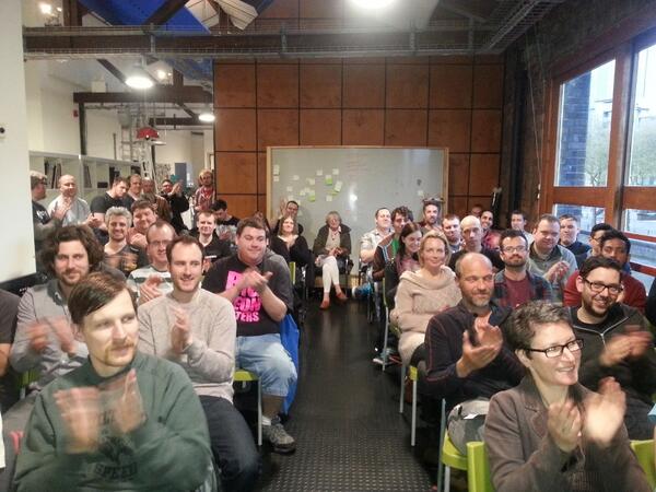
So it's now two days since the Skillswap about Responsive Web Design in Bristol. I am happy to have been one of three speakers and, having just listend to the audio, I think it was kind of okay - which hadn't been my initial impression, so I'm glad there was a recording. I just thought I'd add some thoughts, some of them regarding what I talked about.
I am always amazed how these talks, whether I'm a listener, or as this time a speaker, make my mind buzz. And that includes the chat afterwards in the Watershed bar where this time we had to be kicked out at closing time. It is hard to pin down what it is, but I guess it has to do with sharing an interest, being excited about the same things, talking a common language in a sense. I have not always been totally sure I did actually belong to that "crowd", but I have gradually come to realise that there is no point even asking that question. If you are interested, you go and listen, you belong there, and that's just it. (Which doesn't mean it might not occasionally be difficult, as an introvert, to talk to a bunch of other introverts)
Responsive Web Design and Content Strategy — a winning combination
I would say the event was really successful, but in a pretty unplanned way. There had been various health issues that prevented things from running smoothly. Pete Fairhurst, who was going to talk about how he made the Samaritans website responsive, had to pull out shortly before the talk because of illness. Keir Moffat who gave the second talk, on "Responsivability", had an upset stomach that made him feel pretty unwell, and I didn't even mention that I had just recovered from two days of headache and also having friends to stay (luckily I was feeling well on the day, despite zero sleep - but that's not unusual for me, in fact I often thrive on sleeplessness). What really saved the day was that, at crazily short notice, Bonny Colville-Hyde stepped in to do the third talk. It was about content, called "You can't polish a turd" and was an absolute hit. Bonny answered questions for longer than her actual talk was! (She also increased the number of women who have so far spoken at the Skillswap - New series by 100%, which I think is a welcome side effect.) I admired the relaxed and funny way Bonny delivered her talk, without slides, and I was also struck by how it hit a nerve like that. And it makes sense, if you think how important content is. Both a lack or excess (especially if it's bad quality), can hold up a website so much. And having the ability to make people rethink, and rewrite!, their content, — "you will not always be liked" —, amounts to having magical powers.
The content topic also fitted in quite well with the "Responsive website design" theme, as it becomes really important to get your priority content spot-on when you serve a site to mobile. So while I still find it a shame that I didn't get to hear Pete talk, this was sure a good alternative.
Having said that, I do not mean that Keir's talk, or even mine, went by without interest from the audience, and I enjoyed Keir's very much, even if I found it difficult to tell how mine must have come across. Keir coined the term "responsivability" for being responsible with your responsiveness, which is a very good point, as you can be very irresponsible with it! For example, don't throw lots and lots of code, especially Javascript at it, to make things work. He had a number of great tips and showed some live examples of sites he had built, all without use of any framework, as he said he wanted to learn from "bottom up" to get a real feel for how things worked. This approach has quite obviously served him well, as since building his first responsive website in August last year, he has picked things up very quickly and already built a number of sites. He was also going to do a live-coding session. He did not quite get round to that, but he created a git repo where you can trace the steps for making a sample site responsive.
Responsive web design as a process
To conclude, just a few "Addenda" to my talk. I felt afterwards that there were quite a few aspects of responsive web design that I did not mention, which was probably inevitable due to a lack of time. After all, there are whole "responsive days out". I should have added, for example, that in preparing my talk I had taken the opportunity to establish a process for how to create responsive websites. Moreover my approach is only one way of doing things. But I think exactly that is what every developer, and every agency should do really. Set some time aside to do one project as a way of trying out responsive design techniques. There should be some extra time and budget allocated to that, like for example you do with team-building.
Modular design and CSS
We didn't talk much about the design phase, but in the discussion it transpired that most people so far aren't receiving designs that are adapted to responsive, or if they do get them, they were full-blown separate designs for different devices, which in the end is not that helpful. One thing to mention here is Style Tiles by Samantha Warren as well as style guides.
I talked about using design patterns and writing modular CSS. One example from my own exmaple site which I built for my husband is Nicole O'Sullivan's media object. I used this for the media on the videos and podcast page. The same set of style declarations is used for different elements (video containers, podcast containers, and inside podcast container the image and title). The way I did it could sure be improved, but it was still - for me - a new way of looking at things and implementing design.
IE 9 != IE 8
Just a quick note about Internet Explorer. I mentioned it at several places in my talk, mostly in conjunction with "this is not supported by IE" or similar. What I meant here is of course Internet Explorer version 8 or below. I could also mention here that the fascinating ":nth-child" pseudo-element is not supported by those either, but there is an easy way to recreate this functionality with one line of jQuery.
I might blog some more about things I do on the Matin Durrani website as I go along, as it is a work in progress. I hope to use some more responsive techniques, and I also want to do something about preventing videos and podcasts from being loaded automatically (as they are now). But that's for another day.
For now, thanks to a great audience and speakers, and of course to Tom. It was a great experience being at this Skillswap.