
Responsive Day Out
This post was written 11 years ago.
Tue, 23 Jun 2015
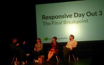
Last Friday, Responsive Day Out ("The final breakpoint") happened in Brighton, and I was glad that I had the opportunity to go there. I had listened to recordings of the previous years, but being in Brighton, hearing the talks live, catching the athmosphere and talking to other attendees is something quite different.
Quite a few talks touched on things that I had been thinking about or experiencing recently. Especially, the difficulty of naming things, and that of being a generalist. On the technical side, there was the responsive images spec which I had recently got to try out, and web components. Flexbox is for now remaining a black box to me — but that will hopefully change soon. The power of CSS selectors for applying style decisions was fascinating, as well as some of the new web APIs.
I really liked the mix of the technical, and the psychological/philosophical. There was an exchange in the first chat (after every three talks there was a brief discussion with the three speakers) that highlighted for me how the respective challenges differ. Jeremy Keith asked "Are the trickier problems the human problems?" to which Alice Bartlett, the first speaker, replied: "People problems are harder to reason about. They are also more likely to provoke an emotional response. Solving a technical problem is more satisfying, and you can more easily brag about it" I believe this to be very true, and it might explain why so many problems between people go unresolved for long times.
The first two talks where about accessibility, and this was also a topic in later talks. I really liked the idea in Alice Bartlett's presentation, of reframing accessibility not in terms of abilities that users lack, but what the service can provide. I imagine that means for example each site should have the option to be operated via keyboard, instead of saying "we need to be accessible to people who have motor difficulties". Rachel Shilcock talked about her experiences of designing with accessibility in mind, and mentioned a lot of good resources, for example HTML Codesniffer and tota11y which can be used as bookmarklets to get information about a site. Also, Contrast ratio by Lea Verou, and Color Oracle.
Naming things and modularity is hard
Alma Kholmatova gave an impressive talk about Futurelearn's approach to create a common, modular design language. "Modularity appears simple, but to implement it takes radical changes". Creating a controlled vocabulary was in her experience one of the most useful exercises. At Futurelearn, there is an ongoing effort to name things in a way that avoids duplication, but is also meaningful.
I was also very impressed by Peter Gasston's talk about web components (Slides), which had a lot of technical information while also providing background about their relative significance, and alternative techniques that achieved similar things (React, BEM, and the new ES6 modules in Javascript). Web components leave the developer with much responsibility. Because of the limitless possibilities they open up, it is also possible to make very bad ones. Which basically means, many bad ones will be created — see Sturgeon's revelation There is a gold standard which developers should adhere to "This is a big opportunity. We need to get it right."
Responsive images are here
Responsive Images have landed! Jason Grigsby said he could not let go of them, because they were interesting puzzles (Slides). "I've been obsessed with them for five years". I had only marginally followed the discussions about different proposals for the markup of image and picture element, but if I remember right it was a very heated debate. But the solution that came out of it, is really very good I think. The key thing is that all the hard work can be left to the browser. With srcset and sizes attributes of the image element, we can state rules as to which image should be used at which viewport width, and how much space it should occupy horizontally. Browsers are starting to support the new elements. If not, there is a picturefill, and with the img element there is always the src attribute to fall back to. "The picture element is progressive enhancement for images". There were interesting considerations about how to determine the breakpoints for switching between resolutions. For example, the difference in memory usage needed for resizing images, is much higher when it comes to large images, so it would make sense to put more breakpoints in at the higher end than lower.
Heydon Pickering and Jake Archibald were both, in different ways, concerned with too much reliance on JavaScript. Heydon showed how much can be done with CSS selectors, which was fascinating. It comprised a lot of nth-child selectors (but not only!), and prime numbers (Slides).
Jake Archibald took an existing web app, talky.io and demonstrated how it could be improved by not having all the JavaScript being downloaded upfront, but rather asynchronously in the background. The original capability of websites, to be viewed while resources were still being downloaded, is often compromised by too many resources being loaded in a blocking way. He also showed how web workers can be used to make apps work offline, using his app SVGOMG as an example. An image I won't forget so soon: A sad disused web worker slowly disappearing into the mist. ;)
Ruth John on the other hand, demonstrated new web APIs. In this case it can actually be beneficial to switch from CSS to JavaScript, as for example with the animation API, you get a lot more control than with CSS animations. I had not even heard of many of the new APIs, for example the ambient light API. Most of them are not yet supported that well in most browsers, but as long as their functioning is not critical for the use of a website, there is of course no harm playing around with them.
Zoe Mickley-Gillenwater showed how flexbox can be used for progressive enhancement. She works for Booking.com where content inside box elements can vary widely in size. It is very beneficial in that case that with flexbox you can design without units. This is, I suppose, again an example of how a lot of the hard work — calculating where which layout should be used — can be left to the browser.
The virtuous generalist
The last three people presenting were Rosie Campbell, Lyza Gardner and Aaron Gustafson. What their talks had in common was the perspective that constraints and challenges, whether they are given by the medium or self-imposed, can actually aid creativity. Rosie Campbell presented exploratory research at the BBC around smart wallpaper, and Aaron Gustafson looked at what the future will bring in terms of accessibility and possibilities of new devices. He predicted that speech will become more important than touch as a way of operating devices, and hit home that in reality everbody has special needs when accessing the web which echoed the first talks of the day.
But perhaps the talk that most struck a chord with many in the audience, and certainly with me, was Lyza Gardner's. It was a talk about the wonder and the struggle of doing stuff on the web. The joy of finding out how to build stuff, followed by the need to keep up with new developments and ever changing demands and possibilities. How easy it is to feel overwhelmed by it all, and how easy also to dismiss what one actually knows and can do.
But I guess the main theme was how we should celebrate how much we actually do when we keep learning new things, evaluating, organising, synthesizing new knowledge. "We reserve our admiration for those how do one thing extremely well", but we should acknowledge the skill we have in learning new technologies and adapting to an ever changing environment. - Except we might not always feel we actually manage so well. But then we should still be aware of all the things we do do.
I feel many things I have heard will influence me when I go back to work, it will be interesting to see in what ways.
Thanks to everybody who made this happen, in particular Jeremy Keith and the speakers.
This post was written 11 years ago, which in internet time is really, really old. This means that what is written above, and the links contained within, may now be obsolete, inaccurate or wildly out of context, so please bear that in mind :)